
I tested the most common Speedball screen printing inks so you can pick the right formula for fabric, dark shirts, neon effects, or paper and wood projects.
I’ve spent hours testing Speedball inks across fabric, paper, and wood to find which formulas perform best for specific jobs. In this roundup I focus on coverage, hand, opacity on dark fabrics, cleanup, and how each ink behaves through a screen.
My goal was practical: help you choose the right jar or starter set based on what you actually print—t-shirts, tote bags, posters, or metallic effects—so you waste less time troubleshooting and get prints that last.
I compared these inks side-by-side using the same screens, squeegees, and heat-set routines so differences in coverage, opacity, and hand feel came down to the ink formulation rather than my technique.
1. Speedball Fabric Screen Printing Ink — White (8 oz) – Best Overall
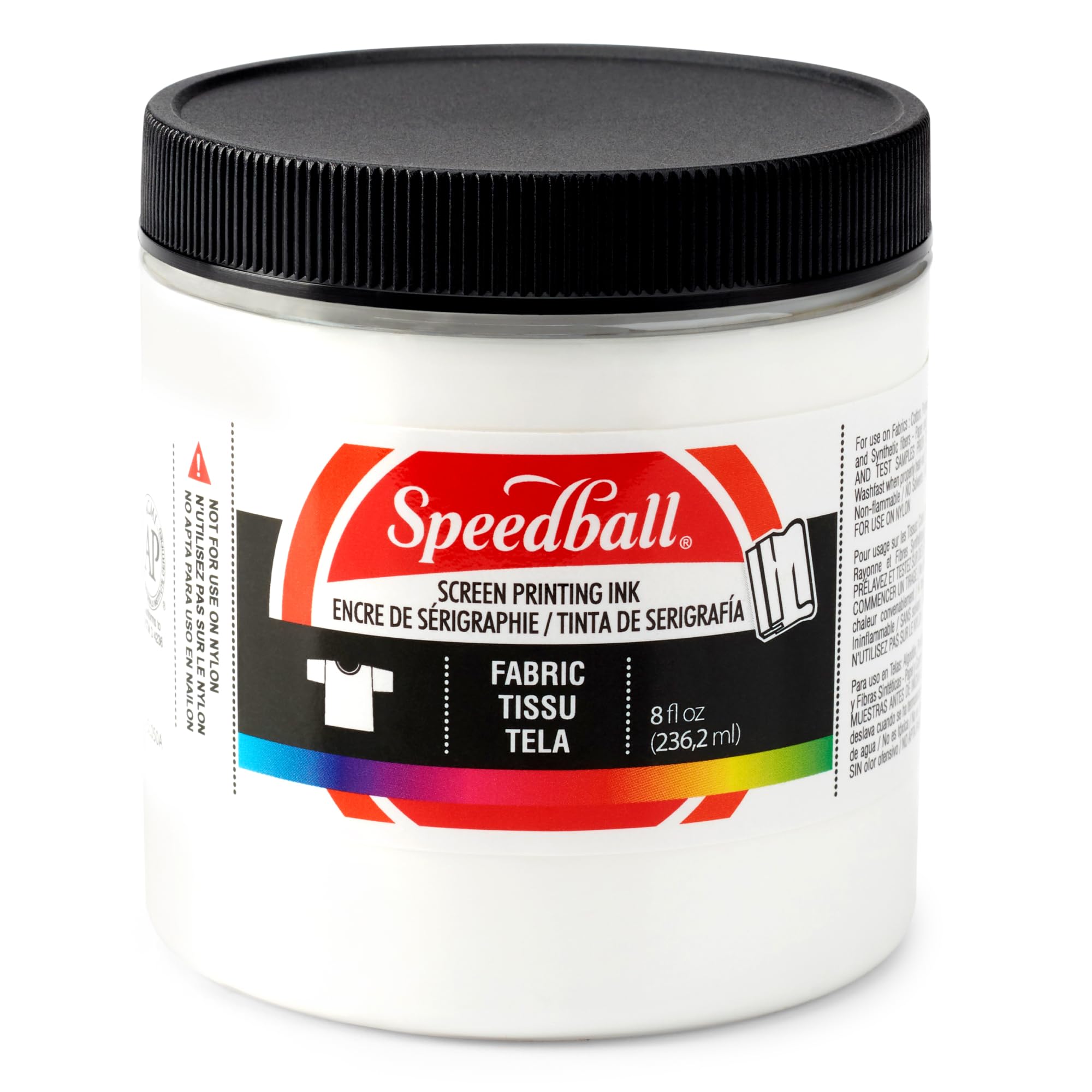
I reach for this white when I need reliable coverage, a soft hand, and an ink that cleans up with soap and water. It prints smoothly across cotton and blends and gives me a permanent result once I heat-set it.
Why I picked it: Consistent coverage, soft hand, easy soap-and-water cleanup.
Best for: General-purpose fabric printing on cotton and blends.
Good value for small runs and frequent replacements.
Pros
- Strong coverage on light and mid-tone fabrics
- Soft hand after heat‑set
- Water‑based, soap cleanup
- Permanent once properly heat‑set
Cons
- Not recommended for nonporous nylon
- Requires heat‑setting to be durable
- Can feel thick on very fine mesh
My take
I used the white on navy and light shirts and got excellent opacity with a single heavy pass when I wanted a bold white. For most of my t‑shirt work it left a noticeably softer hand than plastisol alternatives, which I prefer for wearable items.
Cleanup was straightforward—warm water and soap removed screen and tools without solvents. The ink’s consistency made it easy to pull crisp edges without excessive streaking.
Heat‑setting mattered: I always flash‑cured with a heat gun or conveyor and the prints survived repeated washing with minimal fading or cracking. For nonporous fabrics like nylon I avoided this ink and chose other options.
2. Speedball Fabric Ink Starter Set — 6 Colors (4 oz) – Best Starter Set
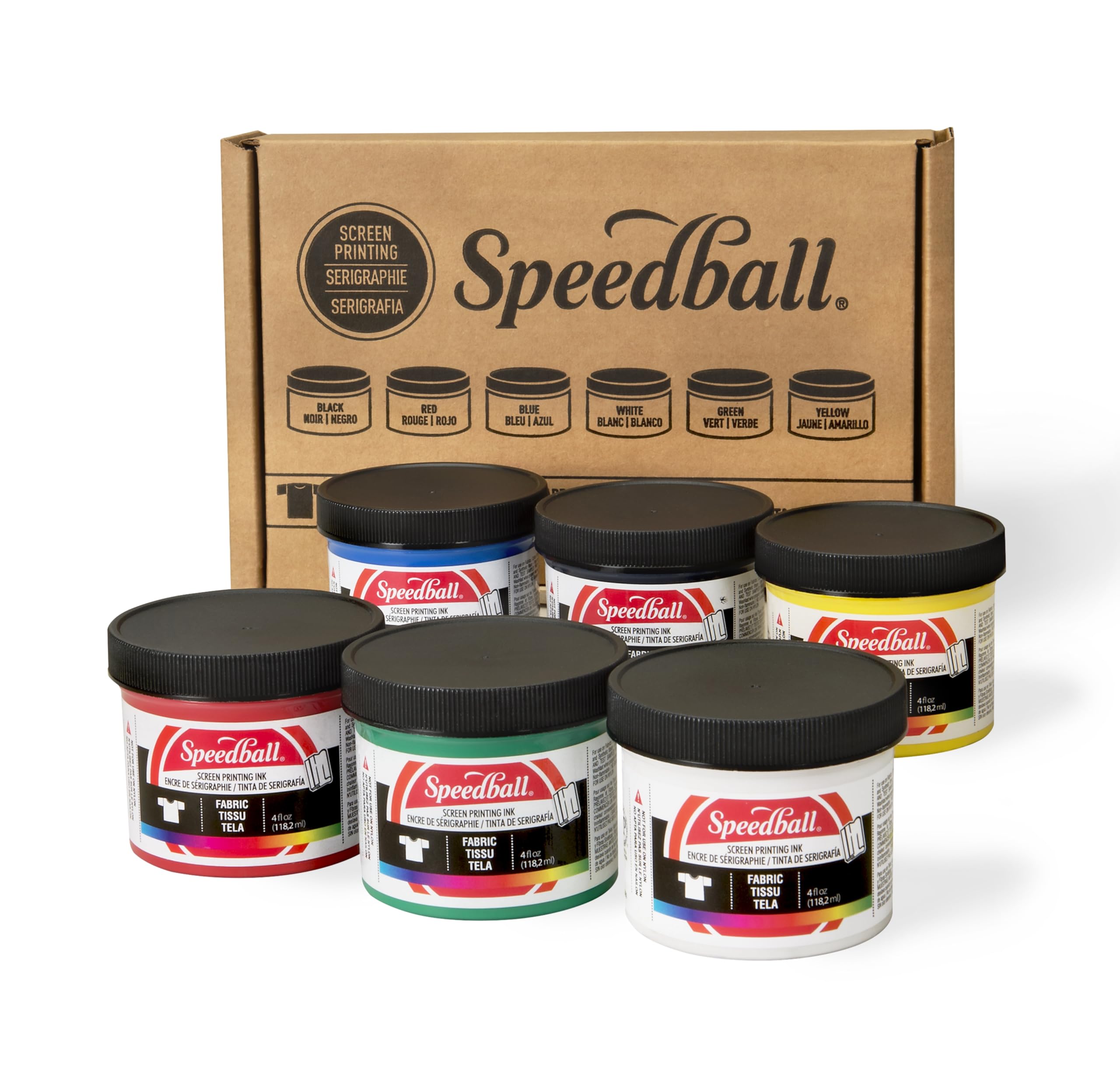
I keep this six‑color set in my studio for quick projects and teaching. The jars mix easily, clean up with water, and cover most beginner-to-intermediate needs without fuss.
Why I picked it: Includes essential colors and mixes well for a basic palette.
Best for: Beginners, classrooms, and small custom runs.
Affordable way to build a workable color palette.
Pros
- Six must‑have, mixable colors
- Low odor and water‑based
- Easy cleanup with soap and water
- AP‑certified non‑toxic
Cons
- Smaller 4 oz jars run out on larger jobs
- Packaging may vary between batches
- Occasional shipping leakage reported
My take
I used the set for a family reunion tee run and the color mixing is the highlight: I blended reds and blues several ways to create custom tones that printed consistently.
The inks are forgiving for beginners—they don’t clog screens, and the low odor made them ideal when I worked inside. After a proper heat‑set, pieces washed well.
Two practical notes: the jars are 4 ounces so they empty quickly on multiple prints, and I’ve seen packaging change between batches, so I store jars upright and check seals when they arrive.
3. Speedball Acrylic Screen Printing Ink — Black (8 oz) – Best for Paper & Wood
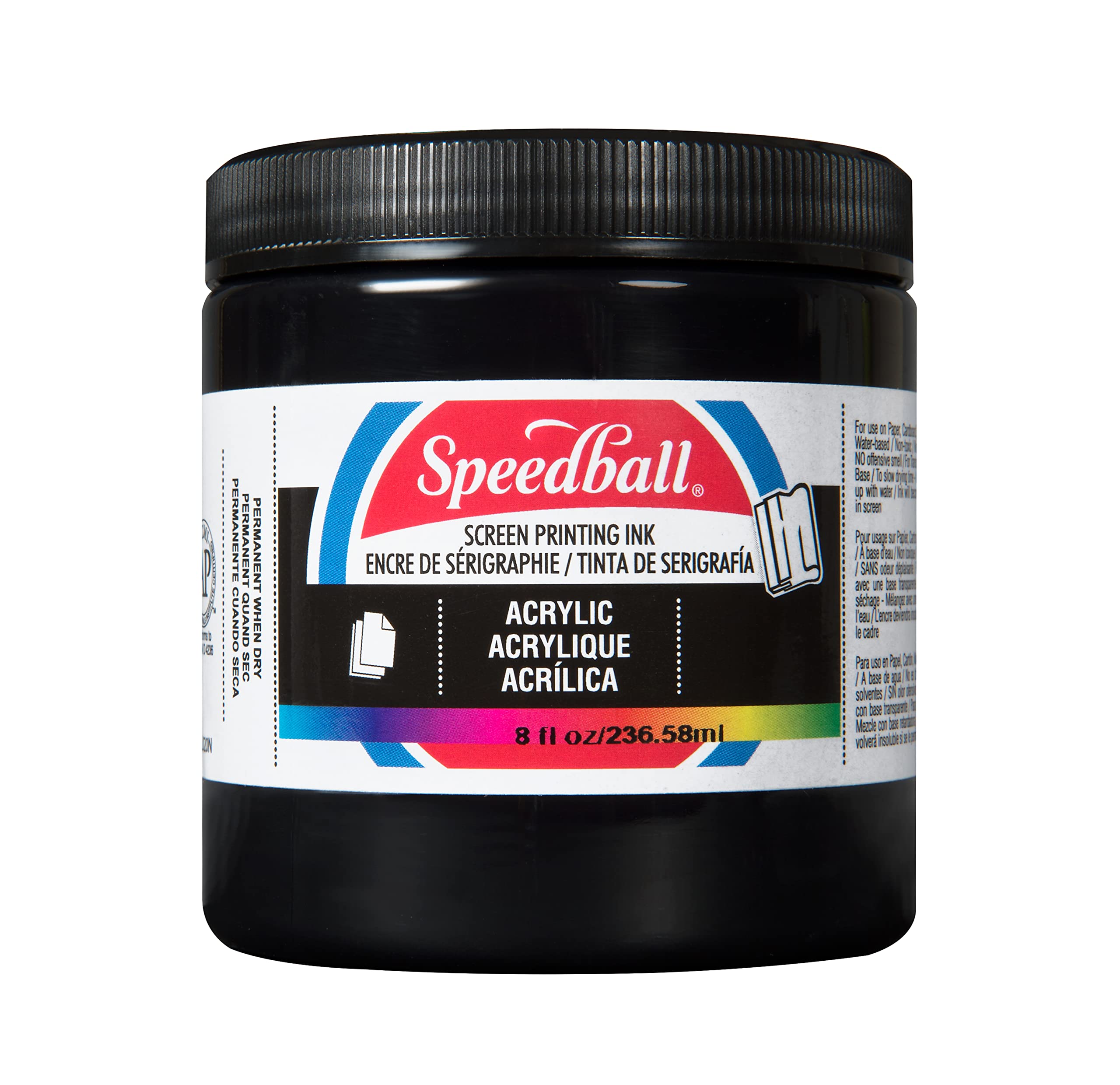
I use this acrylic formula when I want long open time and rich blacks on paper, wood, and cardboard. It gives me time to print complex runs without skinning over on the screen.
Why I picked it: Long open time and rich pigmented colors for non‑fabric substrates.
Best for: Prints on paper, wood, and cardboard projects.
Great choice for craft and fine‑art applications.
Pros
- Unrivaled open time for slow runs
- Rich, deep blacks
- Soap and water cleanup
- Works well on paper and wood
Cons
- Not formulated primarily for fabrics
- Some colors print different than pictures
- Thicker body may need adjustments
My take
For poster work and woodblock prints I appreciated the extended open time—panels stayed printable longer, which reduced re‑wetting and inconsistency on multi‑pass pieces.
Black printed very deep and uniform; edges held crisp detail even on textured paper. Cleanup remained easy with warm water.
If you plan to print garments frequently, I’d choose the fabric formulas instead. I did experiment with small fabric tests and the acrylic behaved reasonably, but the intended use is clearly paper and wood.
4. Speedball Opaque Fabric Ink — Gold (8 oz) – Best for Dark Fabrics
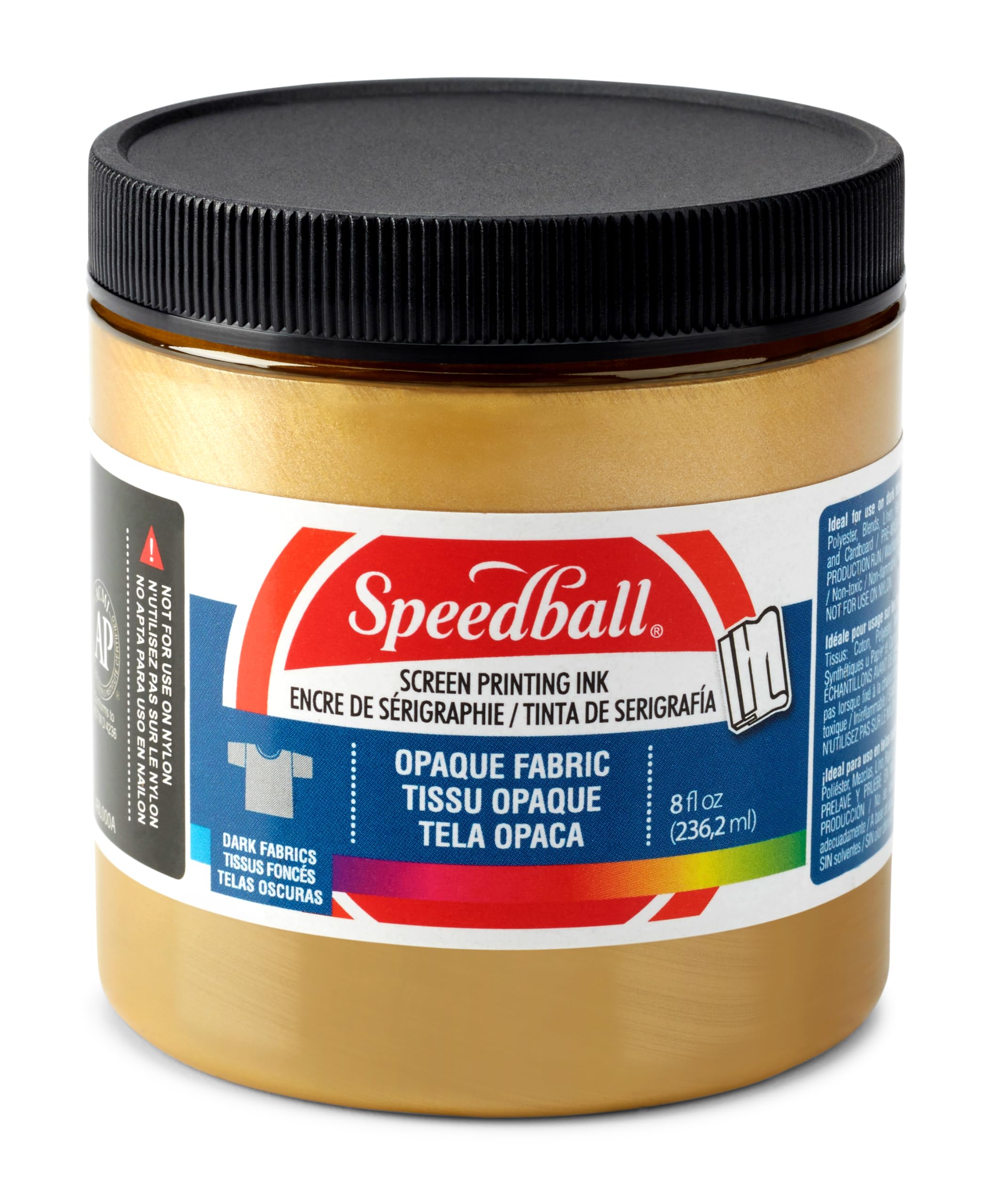
I turn to this opaque pearlescent ink when I want metallic coverage on black and dark garments. It gives a true metallic luster that reads well under studio lights.
Why I picked it: Opaque, pearlescent finish that shows on dark fabrics.
Best for: Metallic effects and high‑opacity prints on dark garments.
Worth the premium for specialty metallic results.
Pros
- Excellent opacity on dark fabrics
- Attractive pearlescent luster
- Permanent after proper heat‑set
Cons
- Can stiffen fabric if applied thickly
- Too thick for very fine meshes
- May require dilution or technique changes
My take
I printed the gold on several black tees and the effect is a true opaque gold shimmer—not foil‑level shine, but a beautiful metallic sheen that stands out.
Because the ink has a heavier body I switched to lower mesh counts and adjusted my squeegee to get a good deposit without gumming the mesh. On some very fine meshes the ink pulled back into the screen, so a coarser mesh or slightly thinned mix worked better.
I also experimented diluting the gold for a dip‑dye effect and the results held up after washing, though heavier coats did stiffen until the first few launderings softened the fabric.
5. Speedball Fluorescent Fabric Ink — Hot Pink (8 oz) – Best Neon/Fluorescent
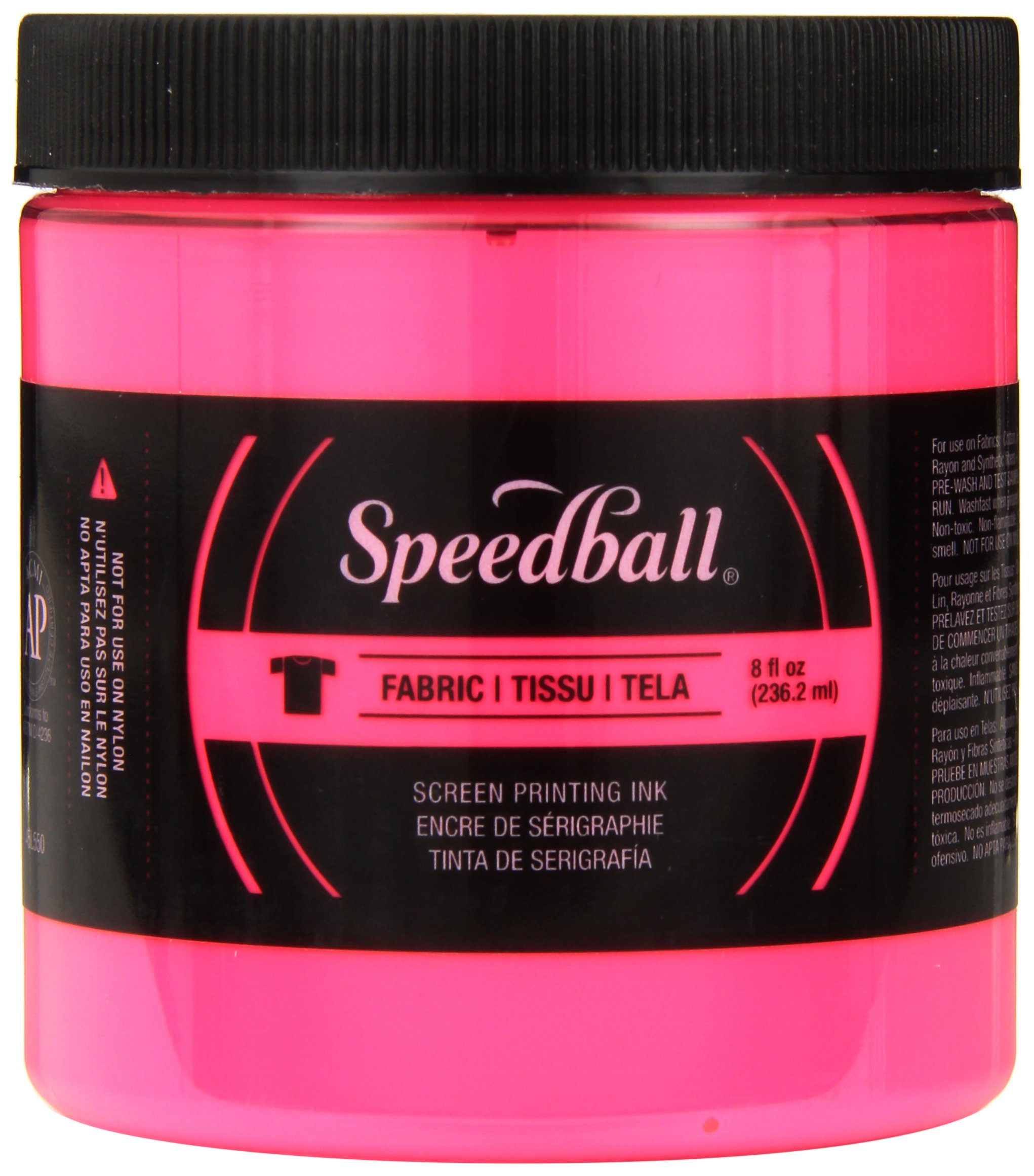
I use the fluorescent hot pink when I need eye‑catching color on light fabrics. It sprays and pulls smoothly and really pops on whites and pastels.
Why I picked it: Vibrant neon payoff on light fabrics and easy handling.
Best for: Bright, attention‑grabbing prints on light garments.
A cost‑effective way to add neon pop to a design.
Pros
- Very vibrant and smooth
- Good consistency for screen work
- Water based and easy to clean
Cons
- Not opaque on dark fabrics without white underbase
- Some fluorescents require heavy underbasing
- Behavior varies between neon colors
My take
On white and light tees the hot pink looked stunning with one pass; the pigment is lively and the ink laid down evenly.
I tried the pink on a black shirt and found it needed a heavy white underbase to reach that same neon intensity. Wet‑on‑wet layering didn’t give me the vibrancy I wanted, so I recommend flashing a white base before printing neon tops.
Overall handling is pleasant—smooth pulls and easy cleanup—but plan for extra steps when you want these colors to read on dark garments.
How I Choose Screen Printing Ink
Substrate and Formula
I always pick ink by substrate first: water‑based fabric inks for tees and acrylics for paper and wood. The right base reduces headaches and preserves hand and durability.
- I use fabric inks on cotton, blends, and most synthetics (avoid nonporous nylon).
- I choose acrylic inks when printing posters, wood, or cardboard for their open time and surface adhesion.
- If I plan to mix metallics or fluorescents, I test a swatch on the final fabric.
Opacity and Color
I think about opacity early—opaque or pearlescent inks are essential for dark garments, while standard colors are fine on light fabrics.
- I use a white underbase for any neon or light‑color print on dark fabric.
- I mix base colors to expand my palette but always test for color shifts after heat‑setting.
- If a color looks different in real life than online, I make a small test print before committing.
Mesh, Viscosity, and Technique
I match mesh count to the ink body: heavier opaque and metallic inks need lower mesh counts, while thin detail inks work with higher meshes.
- I switch to a lower mesh when working with thick opaque or metallic inks.
- I thin water‑based fabric inks slightly for finer detail, but avoid over‑thinning opaque metallics.
- I flash or heat‑set between layers when building opacity with multiple passes.
Heat‑Setting and Durability
I always heat‑set water‑based fabric inks to make prints permanent. Proper curing is the difference between a lasting print and one that fades quickly.
- I follow manufacturer heat‑set recommendations and test washability on a sample.
- I let prints cool before stacking garments to avoid offsetting.
- I avoid using solvents for cleanup—warm water and soap are usually enough with these formulas.
Safety and Practical Notes
I prefer AP‑certified, low‑odor, water‑based inks when working indoors or in classrooms for safety and easier cleanup.
- I store jars upright and check seals on arrival to prevent leaks.
- I label mixed batches with ratios so I can reproduce colors later.
- I keep a scrap pile for test prints before committing to a full run.
Frequently Asked Questions
Can I use fabric inks on polyester and blends?
Yes—I use the fabric formulas on cotton, polyester, and blends with good results. Proper heat‑setting is important for durability on synthetics; for very smooth synthetic surfaces I test first because adhesion can vary.
Do these inks need heat‑setting to be permanent?
I always heat‑set water‑based fabric inks. Heat‑setting makes the prints durable through washes; without it the prints are more likely to fade or crack.
Are fluorescent colors visible on dark shirts?
Not without preparation. I print fluorescents over a heavy white underbase and flash between layers to get neon pop on dark fabrics—wet‑on‑wet usually won’t be enough.
How do I clean screens and tools after printing?
I clean screens and tools with warm water and mild soap right after printing. These water‑based formulas rinse more easily than solvent‑based inks and are kinder to studio environments.
Final Take
I lean on the fabric-specific Speedball inks for most garment work because they give me the soft hand and washability I want, while the acrylic line is my go‑to for paper and wood.
If you’re starting out, the six‑color starter set is the quickest way to build a functional palette. For dark garments, pick an opaque or metallic formula and adjust mesh and technique accordingly.
My practical tip: always run a small test print and heat‑set the sample. That simple step saves the most time and frustration in real projects.
")